Today, I will deal with trading Forex charts and how to work with live Forex market charts.
The appearance of different Forex charts may discourage many traders, especially newbies. It seems that only an experienced trader can understand and correctly read trading charts.
But it only seems so. Each type of Forex chart is designed to make trading more convenient, rather than to confuse retail traders. When you employ charts, it becomes easier to analyze a huge amount of data, so price based chart analysis becomes more productive and accurate. For a trader who operates with large volumes of information (usually numerical), it is very important to be able to translate this information to a different, less abstract form.
The article covers the following subjects:
Major takeaways
| Main Thesis | Insights and Key Points |
|---|---|
| Definition: | Forex trading charts are essential tools for understanding market trends and making trading decisions. |
| Live Forex charts | Forex charts provide real-time insights into price action, helping traders make informed decisions. Each chart type offers unique insights into forex market movements. |
| Charts and price quotes | Forex charts depict price movements over time. They help traders understand market trends, highs, lows, and price action. Different chart types offer varied perspectives on price quotes. |
| For beginners: | For beginners, understanding forex charts involves recognizing patterns, interpreting price movements, and utilizing them for trading strategies. Different charts like bar charts and candlestick charts have distinct features. |
| How to read: | Reading forex charts involves interpreting opening and closing prices, highs and lows, and other features specific to each chart type. For instance, candlestick charts provide color-coded insights into price rises and falls. |
| Types: | The article discusses various forex chart types, including Japanese Candlestick charts, Heikin Ashi Candles chart, Area Forex charts, Point and Figure chart, Tick Forex chart, Renko chart, and Kagi chart. Each chart type offers unique insights into forex market dynamics. |
Live Forex charts
First of all, I want to give you the links to free Forex charts (I would say, best Forex charts online) for all currency pairs and other asset classes in this convenient system I use most of the time.
Forex (foreign exchange) currency rates and charts online are available here.
Precious metals prices charts (gold, silver live Forex charts) are available here.
Oil Forex graphs in real-time are available here.
Online cryptocurrency charts are available here.
Online stock market charts are available right here.
Online charts of stock market indexes are available here.
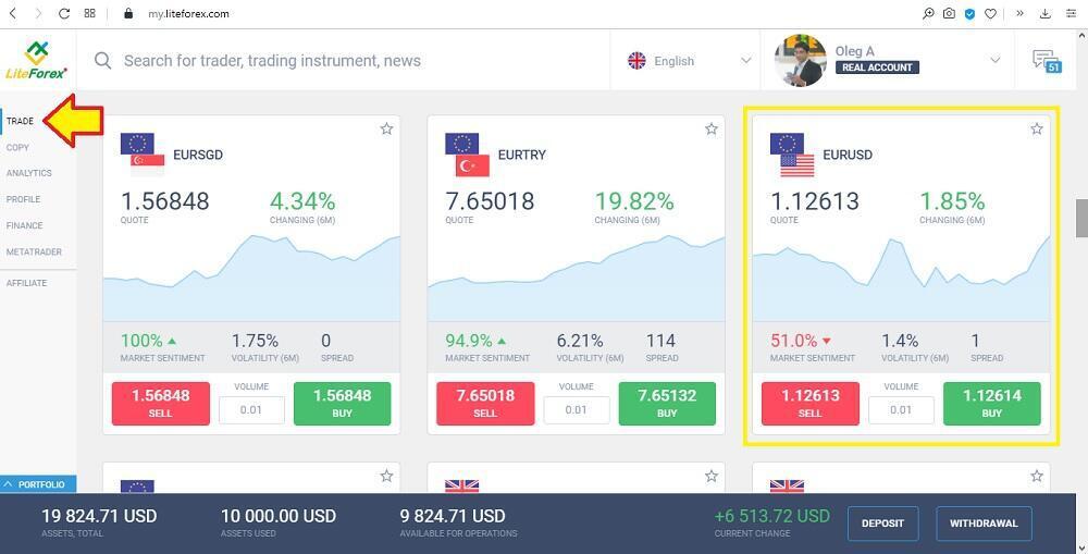
To unfold a price chart in the system, just click on the card with the currency or other asset needed.
You can add charts to your “Favorites” section so that the prices of currencies and other financial instruments you need were always at hand. To use the “Favorites” feature, just register (it's super-fast). That’s it - you can just click on the star symbol of the currency you need to form your own list of online charts.
What are Forex charts and price quotes?
Foreign exchange trading charts are an introduction to currency pairs trading. A trader needs to accurately identify trends in advance. To identify investing opportunities, you should know how Forex charts are constructed, what different types of charts exist, what are the trading time frames, how to set up the visual display of the price action.
In modern trading, there are two basic approaches to the forecasts for price in the future. The first is the analysis of everything that surrounds a financial asset or fundamental analysis (economic calendar, political news, general market commentary, exchange rates, etc.). The second one is the analysis of the price itself, or technical analysis. If it is more or less clear with fundamental analysis; technical analyst only need to analyze the information about a financial instrument, its financial indices, rumours, news, official statements, then, with analyzing the price itself, everything is different. To analyze the price there is no need to monitor it. To monitor the price changes for a financial instrument, special price charts were developed.
From school, we know perfectly well that the chart is a line that changes along two axes. So, the price chart for trading activity looks exactly like this. This is a line that changes along the time axis and price axis (quotes).
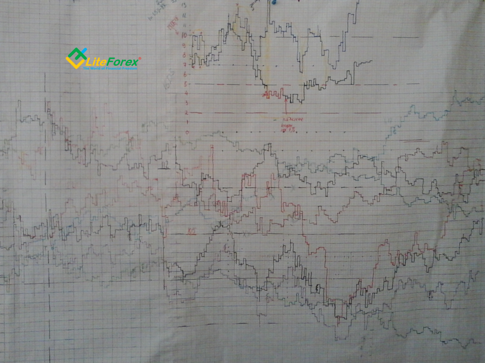
When the first charts appeared, computer technologies were not developed, and traders couldn’t follow the price changes on the computer screen. That is why investors draw the first price charts on the graph paper. Most often, they were dots that, according to the price changes during the day, were connected with a line.
A chart shows graphically the changes in the given data in time as well as relative to each other. Traders used the following data to build the charts:
- OPEN – opening price – the price of the instrument at the beginning of a trading period.
- CLOSE – closing price – the price of the instrument at the end of a trading period.
- HIGH – maximum price for a certain time period.
- LOW – minimum price of a certain time period.
- VOLUME – number of contracts concluded during a certain time period.
Nowadays, traders can see the charts for any time period and for any financial instrument on the computer screen. But the Forex charts are drawn according to the same principles as in the past. They are based on the time and the price value.
The main purpose of the chart is the ability to always refer to historical data and see how the price was changing some time ago. Then, based on these data, you can see some regularities or chart patterns (cyclical nature), and suggest a forecast for the future and assume what the price chart will look like after a while. It is the necessity to refer to the history and a search for pattern formed the need to present the chart in a new way, different from a common horizontal or vertical line.
Learn how to understand Forex trading charts for beginners
First, you need to open a demo account after you register on the LiteFinance website. It won’t take more than a minute, it doesn’t require the deposit top-up or verification. It is necessary to have a look at charts and understand everything I will write further. Click on the Registration button on any page of the website, it is in the top right corner and follow the instructions. Next, you click on the Currency section and select the chart of the most popular Forex currency pair, the US dollar versus the euro (namely, the exchange rate for the EURUSD).
A Forex chart graphically depicts real-time price changes. A trading activity chart shows the current Forex currency pair quotes (in our example, how much is 1 euro in US dollars).
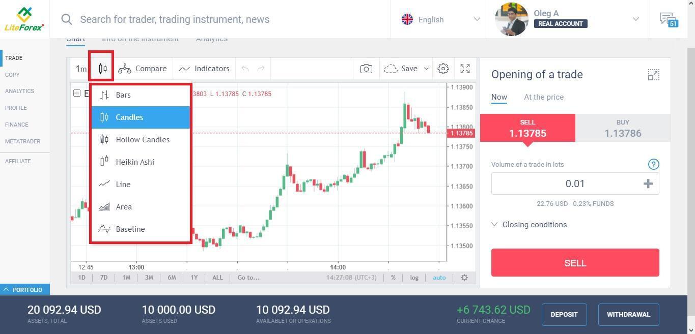
Let us study the main control panel of the LiteFinance trading platform (live Forex chart).
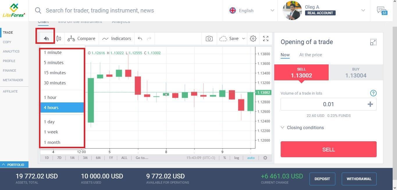
1. Timeframe of the Forex chart
A time frame refers to a particular period used to plot price quotes and display the chart. For example:
In a candlestick Forex chart, the timeframe corresponds to one candlestick. If the timeframe is M30, each candlestick displays the range of the price changes every 30 minutes. You will learn more about the candlestick chart further in this article.
- In a line Forex chart, a dot is the closing price of a timeframe (most commonly). When each 30-minute period ends, the chart draws a dot corresponding to the final value in the period. Next, all points are connected by a line.
You can learn more about how to choose the best time frame to trade foreign exchange in this overview.
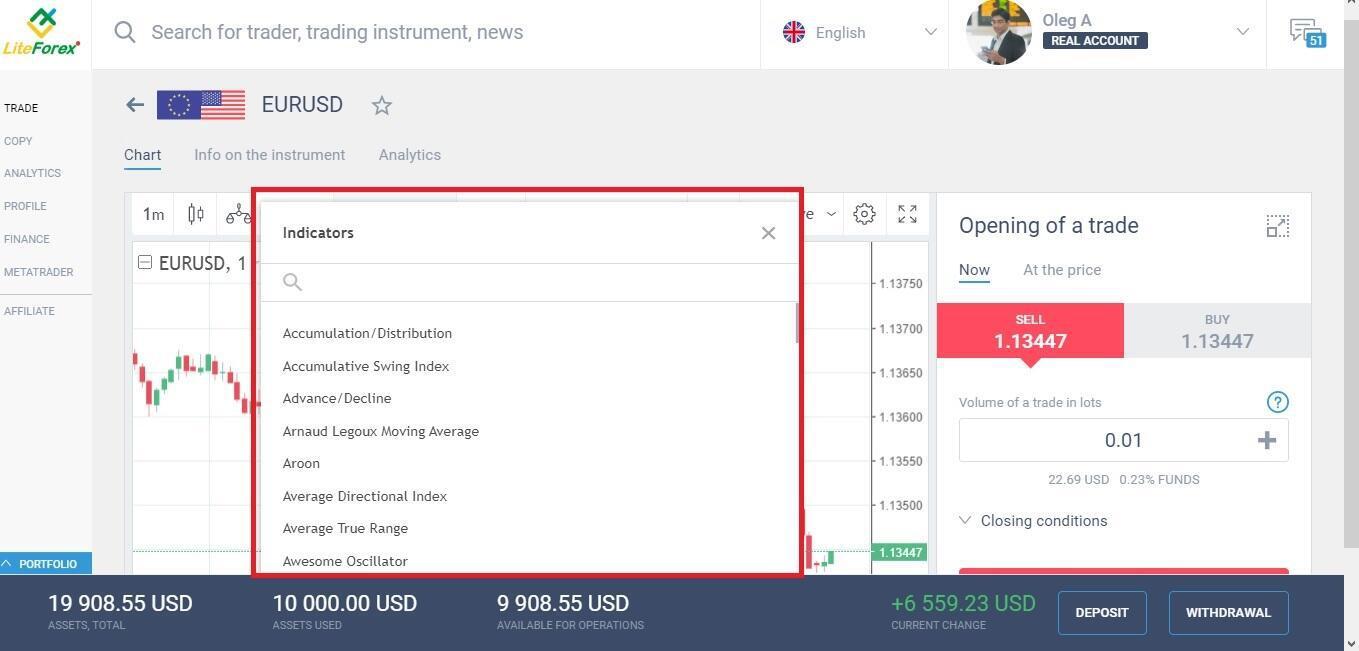
2. List of technical indicators in the Forex chart
Here you can select trading technical analysis indicators that you want to attach to the Forex chart.
Now, I move on to explain the options of the Forex currency pair quotes chart. Let's look at the components of the Forex chart online.
3. Price scale and time scale
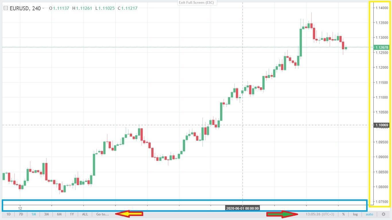
The yellow box is the price scale. It displays correlation of EURUSD currency pair. The current market price, 1.12678, is highlighted with green. It means that you can buy 100 000 euros for 112 678 US dollars right now. The green color means that the price is rising at the moment. The red color would mean that is falling. The thin horizontal line indicates the current price level relative to the previous quotes, it is convenient for the visual analysis. As the current price is constantly changing in the live Forex chart, the color of the current price, green/red, will be also changing all the time.
The blue box marks the time scale that shows the EUR value past performance. If you point to the candlestick with the mouse cursor, you will see the date of this price below on the timescale, the price itself will be indicated on the right scale. It is marked with black on the screenshot.
The yellow arrow shows another scale. It allows changing the time of the historical data displayed. For example, if you choose 7D, the chart will indicate the price changes over the past 7 days. The green arrow points to the menu for switching the type of scales (percentage and logarithmic), as well as the current time and time zone.
A few useful tips:
You can change the scaling manually by the scroll (without the scale below).
You can move the chart at a selected scale in any direction. For example, if your scale is seven days (7D), you can move the price data from the June 1-7 period to the May 1-5 period. You should hold down the left mouse button and drag the graph to the side. If the explanation seemed confusing, follow this instruction step by step on the chart yourself, you will understand everything at once.
How to read Forex charts
Trading starts with learning how to read the trading chart. If you understand the principles of the constructions of the foreign exchange trading chart, you can next study the factors affecting the interpretation of the chart (technical and fundamental analysis).
The price movements in the Forex chart may be presented in different ways. Each type of Forex trading chart has its pros and cons.
Let us cover each type of Forex chart in detail and try to learn how to read Forex charts.
Forex charts analysis using different types of charts in Forex trading
Nowadays, graphic analysis suggests three main types of charts in Forex trading which displaying the price: Line charts, Bar charts, Japanese Candlestick charts.
Now, let us move on and study the most important issue. I shall cover all types of price presentations on the live Forex charts online so that you will able to read Forex charts and analyze asset value movements correctly. Remember that I use the US dollar price chart to illustrate further information. Well, let’s get down to business.
Line chart Forex
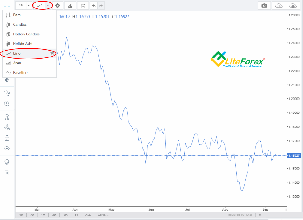
This chart type was developed first, at the very beginning; that is why it is the simplest and the least informative. The chart is drawn rather simply. Each new period of time has two main parameters; they are the open price (the price when the new period starts), and the close price (the price when the time period finishes forming). Each of these parameters forms a dot in the chart; then, the dot of the open price connects with the close price. The continuous connecting of dots draws a line.
Nowadays, this price chart is seldom used, as it doesn’t provide any information about the price highs and lows during a particular period of time. However, some technical analysts perform their analysis, based on this type of chart because it is the most accurate for operating with trends, as it smoothes such things as a false breakout of the trendline or a price level.
What should be added? Let’s see the main features of the type of chart visualization.
The Line chart Forex is not suitable for trading according to the price patterns, based only on geometric shapes.
This Forex trading chart is more efficient for long time periods, starting from D1 and longer, as in these time frames, trendlines look like the price ranges; to draw them, the key parameters of the price are important.
This type of display is often utilized in combined strategies, based on the chart and EMA technical analysis indicator, because it sends more exact signals to enter and exit a position.
Forex Bar charts
Forex Bar charts of the price was developed after the line chart. This type of Forex chart is more informative and complex. It was created in the USA, so it is quite popular in Western countries. Most conservative Forex traders in the West still don’t apply any other types of price charts. Let’s see what this chart contains.
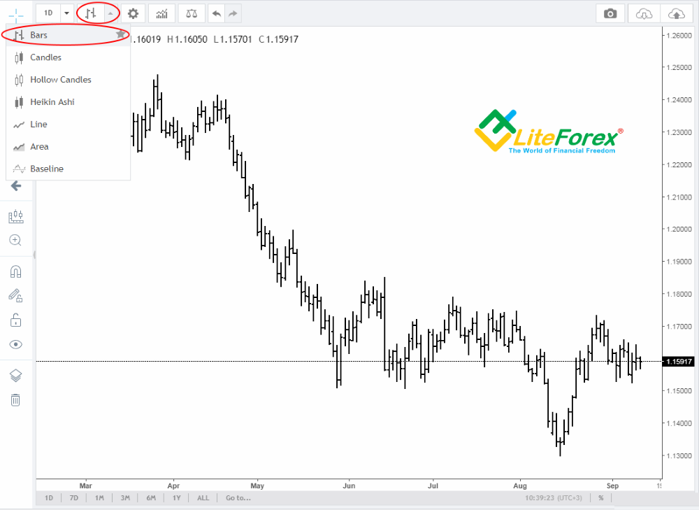
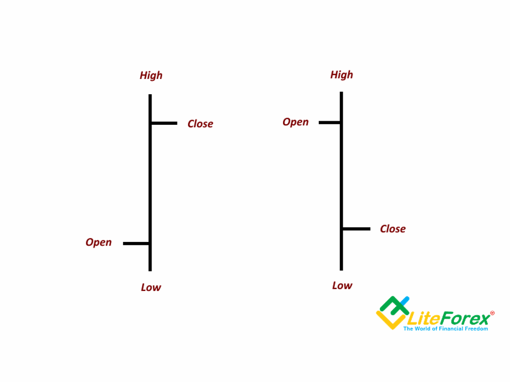
The bar chart consists of a series of vertical lines that are called bars. In a bar chart, any trading interval is represented by a bar, a vertical line, drawn from the lowest price to the highest price of the day. Bar chart expands upon the line chart, and the bars provide information more about the price as they high, low in addition to the opening and closing prices in a particular period of time. You know that during the price movement, it can go higher than the final closing price several times. Price high shows what highest levels the price reached during the time a bar was forming. The same is with low, only, the lowest price levels are analyzed. Vertical lines helps a technical analyst to spot the price trend within a particular period, which is very important for a thorough analysis of the price action in Forex charts.
What should be added? Main features of the bar charts:
1. The opening price is the horizontal dash on the left side of the vertical line and the closing price is located on the right side of the line.
2. Bar charts come in two types: rising bars and falling bars. In the rising bars, the opening price is lower than the closing price; for the falling bars, it is vice versa.
3. There are many special trading strategies to operate with bars, the main ones are pin bar trading strategy, inside bar trading strategy, engulfing bars.
Japanese Candlestick charts
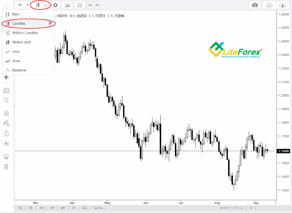
Candlestick charts originated in Japan and have become extremely popular among Forex traders and investors in other assets. It is traditionally thought to have been developed in the 18th century by Munehisa Homma, a Japanese rice trader in order to track price highs and lows. This price chart is the most informative as it combines all main types of charts and surpasses bar chart as it also provides colour information about a rise or a fall. Let’s see what this chart type consist of:
The candlestick consists of a black/red or white/green body and top or bottom shadow. Some descriptions include such concept as the candlestick’s wick. Top and bottom shadows display price high and low for a certain period of time. The top and the bottom of the candlestick’s body display the opening and closing prices.
If the closing price is higher than the opening price, the candlestick’s body will be white/green. If it is lower, the body is black/red.
When the closing price is the same as the high or the low, there may not be one of the shadows (or both). When the closing and the opening price is the same, there may not be the body; such candlestick is called doji.
However, no matter how informative this type of price chart is, candlesticks do not contain information on price movements within the time interval; they neither indicate whether the high or low was reached first, how many times price rose or dropped. To get this information, you should switch to a shorter timeframe of the chart. Nowadays, the most popular way of display is Chinese style, where a rising candlestick is green and a falling one is red.
Japanese Candles charts consist of a series of thin vertical lines. Each candlestick appears after the previous one has closed. Several consecutive candlesticks, one above the other, form a rising trend, and the same with a downtrend. As the candlesticks are of different colours, it is much easier to identify trends in the chart, because they look like a series of lines of the same colour. What should be added? Let’s see the main features of the candlestick chart.
1. A special feature of a candlestick is that the opening and closing prices are displayed as the lower or upper boundaries of the candlesticks body. For a growth candle (white), the opening price is always below, and for a falling candle (black), the opening price is always on top.
2. Candlesticks can be of several types: white growth candlestick with shadows, white growth candle without shadows, a candlestick without shadows and a body, a candlestick without a body but with shadows, a black candlestick with shadows, a black candlestick without shadows.
3. There are many trading strategies, applying Japanese Candlestick charts. There has even been developed a particular type of technical analysis that is called candlestick analysis. The analysis suggests looking for repeating combinations of similar candlesticks. They are called candlestick chart patterns. Nowadays, there are over 100 patterns; but few of them a really popular.
Now let's look at the more complex and rarer types of Forex chart displays. Advanced charting techniques open new opportunities and help you make more robust trading decisions.
Heikin Ashi Candles chart
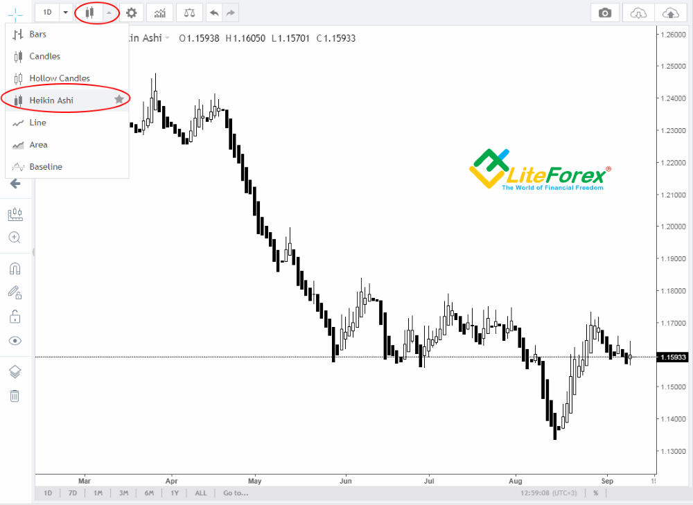
The Heikin-Ashi chart appeared after the Japanese candlesticks were invented. The chart resembles a regular candlestick chart except for one crucial difference. Each new candlestick opens in the middle of the previous candlestick's body. All the other parameters remain the same. Since the Heikin-Ashi chart's candlesticks often have no shadows, they show strong trends more clearly. The price should cover half of the previous candlestick's body to form a new one. That is why candlesticks often lack shadows, indicating the movement's strength. The Heikin-Ashi chart smooths the long shadows seen on a regular candlestick chart, taking an average of the price movement. What should be added? Let’s see the main features of Heikin-Ashi candles charting technique:
1. Heikin-Ashi candles chart filters out all market noises, and so you see the trend alone. In fact, this chart is a trendline technical indicator.
2. When the trends are displayed in the Heikin-Ashi chart, there are almost no opposite shadows; the length of the shadows and the number of candlesticks indicate the trend strength.
3. In the Heikin-Ashi chart type, candlestick chart patterns like, doji, for example, are much more important. When you operate with common candlesticks, a doji is a kind of stop sign; but in the case with Heikin-Ashi candlesticks, this chart pattern is already a strong signal of the trend reversal, and so of an entry.
Due to filtering out minor sideways movements, this chart indicates strong trends and hides slight corrections.
Construction rules, identification of major signals, and the specific features of trading with the Heikin-Ashi chart are here.
Area Forex charts
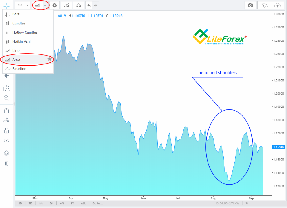
Area Forex charts type is an offshoot from common line chart, but its displays the price movements by means of areas. Its main advantage is Area charts are very clean and simple to use. Filling the space below the price really highlights the price trend. An area chart clearly displays local price movements, spikes and dips in any trading period. This charting technique is usually used to display the profitability of investment objectives.
What should be added: Let’s see the main peculiarities of Area charts.
1. A feature of this type of price chart is that local price movements are clearly visible, such as corrections and minor dips within the time interval.
2. An area chart is a great chart type to discover and identify chart patterns.
3. Area Forex chart clearly shows price changes in relation to the previous period. It highlights the price action without complicating it. Filled areas make it easy to memorize the price action. If you need to remember the price chart, then an area chart is an ideal choice.
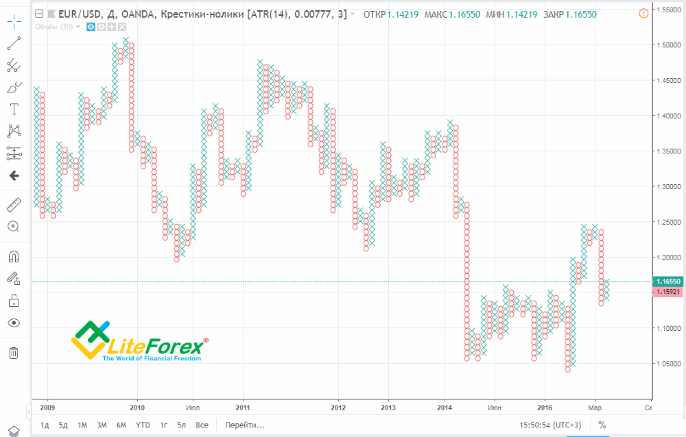
Point and Figure chart (Tic-Tac-Toe chart)
Point and Figure charts originated in the middle of the 19th century by the first technical traders. It was not basically a chart, rather it was forecasting method, using point and figures. Most price charts, utilized in the modern analysis, are constructed based on the opening price, closing price, high and low during a particular time period. But the point & figure chart is constructed based on just the closing price for the period. Point and figure charts are characterized by a series of Xs and Os. The Xs represent upward price trends and the Os represent downward price trends. Each box on the chart represents the price scale, which adjusts depending on the price of the instrument.
For trading, you need to adjust the chart according to two main parameters:
1. Box size. It is the number of points, each box represents.
2. Reversal criteria. The number of points the price has to move in order for a column of Xs to become a column of Os, or vice versa. That is to create a new trend.
What should be added? Let’s see major features of the Point and Figure chart:
1. The chart reflects price movements without time or volume concerns, so it can take from a few minutes to a few days to construct each column, depending on the price movement.
2. The box in the Tic-Tac-Toe chart doesn’t represent a particular price; it represents a price range that is within the box size.
3. Signals in the Point and Figure chart are quite simple: when an O box appears, following a column of Xs, it is a sell signal. If a new X box appears, after a column of Os, a new uptrend begins, and so, it is a buy signal.
4. Support and resistance levels are especially important in Point & Figure charts. As it doesn’t display highs and lows, these are clear horizontal lines; when the price breaks them out, it is a signal to enter a trade.
You can learn about drawing the Tic-Tac-Toe chart, defining its principle signals and chart patterns to buy and sell here.
Tick Forex chart
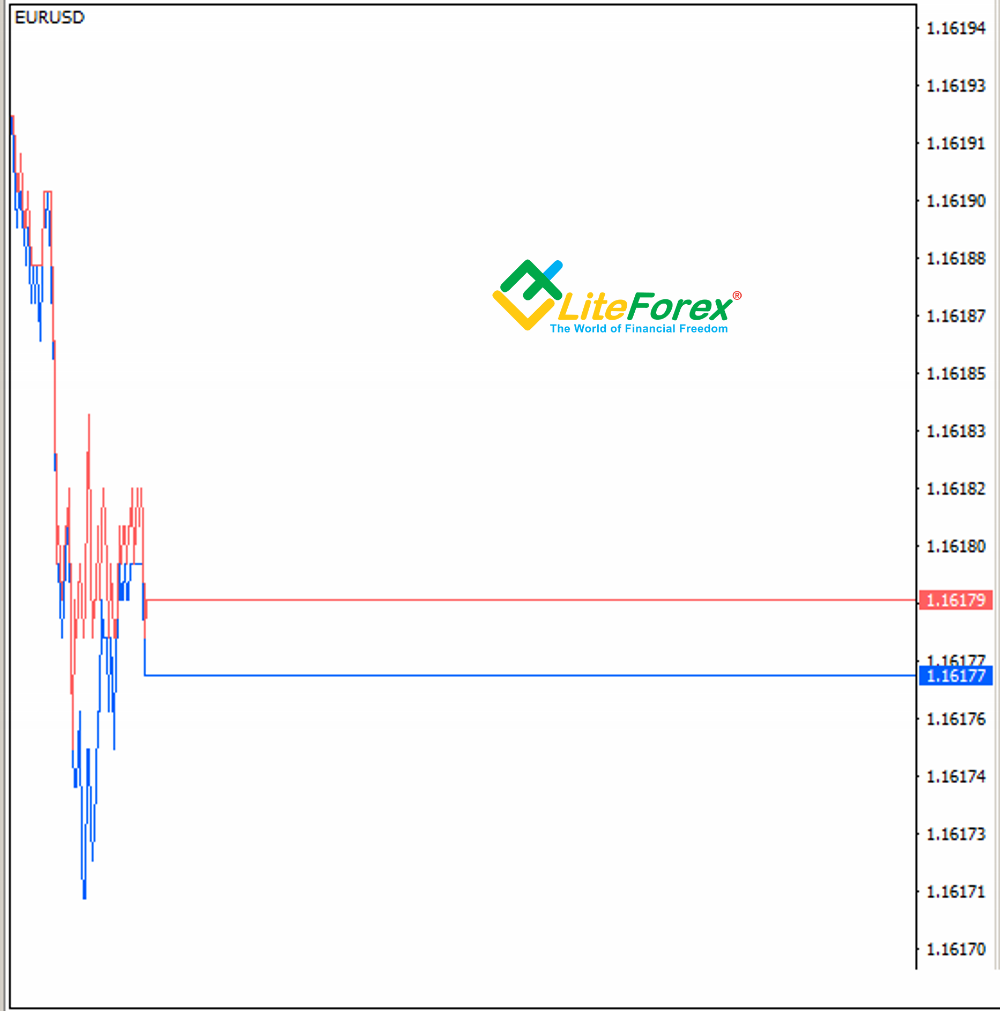
Tick forex charting technique represents a line display of the rate swings, represented in ticks. Tick is a minimum price change on the exchange; in other words, tick is each price swing. Based on this charting technique, the basic type of volume in Forex is calculated, tick volume.
When working with a tick Forex chart, it is very important to have an idea of two prices at once - Bid and Ask, because they represent a commission (spread), and, as long as the value of this commission changes depending on the swings frequency, there may be times when there is no commission at all or it becomes big enough. This type of chart is used in a special work strategy called Arbitrage.
Ticks, displayed in the chart come into three main types:
1. Upward tick appears when a deal between a seller and a buyer was conducted at a higher price than the one before.
2. Downward tick appears when the last transaction is made a the price lower than the previous one.
3. Zero tick appears when the transaction is carried out at the same price at the previous one.
What should be added? Let’s analyze the main features of Forex tick chart trading.
1. Tick charts are sometimes called the chart of market-maker, because it clearly displays all market changes of the price, for example, slippages.
2. Tick Forex chart will suit you for trading only if your broker provides trading with minimum spreads or with zero spreads, the trends, represented in tick charts are too short.
Renko chart (Renko candlesticks)
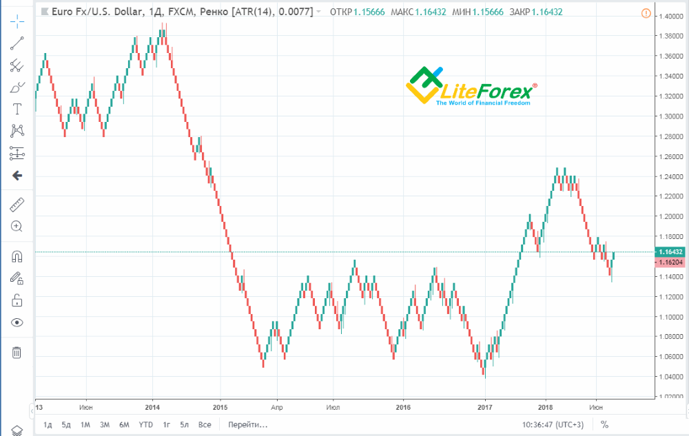
Renko charting technique is a mix of a plain Japanese candlestick chart and the work principle of Point and Figure chart. Renko charts were developed to filter out the market noise that often appears in common charts during sideways trends (trading flat). Due to Renko construction principle, it rarely displays flat, so it seems that there are always trends in the chart. To operate with a Renko chart, like with Tic-Tac-Toe chart, you need to adjust two major parameters:
1. The brick size represents how much the price should change to draw a Renko candlestick in the chart.
2. Reversal criteria. The number of points the price has to move in order for a new candlestick to form. This is a basic parameter whose is twice as much as the Renko bar size.
What should be added? Let’s see main feature of Renko chart type.
1. Renko technical analysis charts excels at highlighting trends as it ignores “noise” movements that are less than the brick size.
2. Renko Forex charts almost completely filter out market noises, but you must remember that you need to trade in middle-term time frames.
3. Technical indicators like oscillators are much more accurate with this chart type.
4. Sometimes you have to wait for a long time for a new brick, which can disrupt the work of your trading strategy, especially if you utilize Expert Advisors.
A very detailed comparison of the Japanese candlestick chart and the Renko chart is here.
Kagi chart
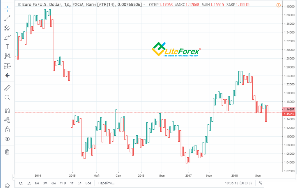
Kagi chart looks like a series of vertical lines that depend on the price action and don't at all depend on time, like most of the common charts. The line in the chart changes its thickness depending on high the price of an instrument behaves. It is the variable thickness of lines in charts of this type that is the signal for traders to enter a trade. This chart type is basically a technical tool, as it combines major principles of EMA technical analysis indicator. Kagi chart has a basic parameter of the trend reversal level that is, by default, 4% of the previous price movement.
What should be added? Let’s see the major parameters of the Kagi chart type.
1. When constructing a Kagi chart, the principle of signal accumulation is used, when a reversal signal appears and then is outbid.
2. To get a more accurate signal, many Forex traders use the combination of the previous kagi interruption and an increase in the line thickness of the new kagi.
3. This chart type is excellent for trading in long time frames.
You can study a detailed guide to trading with the Kagi chart and the description of Kagi charts here.
FAQs
If the price in the chart goes up, the price of a currency pair is growing. This means that the first - base currency of the pair is rising in price relative to the second currency (quote currency). In this case, it will be profitable to open a long position (buy) and monitor the trend further. Conversely, if the price in the chart goes down, then the base currency is becoming cheaper relative to the quote currency, therefore, you need to open a short trade (sell). Thus, an increase in the EUR/USD pair will mean that the price of the euro is increasing relative to the dollar, and a fall will mean that the price of the dollar is increasing relative to the euro. It’s crucial to note that foreign exchange trading carries risk. It’s possible to trade foreign exchange with margin, consequently you should know that leverage creates additional risk as the loss may exceed the amount of the initial investment. Thus, before you invest money in foreign exchange and look for any trading opportunities, it’s important to seek advice from an independent financial specialist and develop your trading strategy in accordance with your risk appetite and trading objectives.
First, you have to choose a type of chart you will be working with. There are three basic types of charts generally available over all trading platforms: a line chart, a bar chart, and a candlestick chart. All three give traders different sorts of data to trade with. A line chart draws a line basing on closing prices - one at a time. A bar chart shows the opening and closing prices of financial instruments and their highs and lows. A candlestick chart is quite close to a bar chart, though it is easier to see whether the bullish or bearish sentiment is prevalent on the market right now. Having determined the chart you like best, it's time for technical analysis. In the LiteFinance platform, you can add multiple technical analysis tools to the chart and determine whether to buy or sell an asset easily.
Upon finding the type of chart that suits you best it's best to draw support and resistance levels that will give you an overall picture of market conditions. The first thing you need to do is identify all highs and lows of the period you are working with. Then you have to add lines linking all the highs and lows you identified. That's it! You have working support and resistance levels and can go on from here. Note that the lines will almost never lie perfectly, so don't worry - they nevertheless show support and resistance zones well.
Price charts of currency pairs or other financial instruments in the Forex market can be found on the website of the broker you trade with. You might as well be interested in the MetaTrader 4 (or 5) platform which is often used by professional traders. Using price charts is especially convenient with LiteFinance since you can change the type of chart in one click and add all the necessary technical analysis tools from an easy-to-use menu. In addition, you will find many financial instruments to diversify your portfolio, professional traders whose trades can be copied and many other interesting and profitable options. Be aware that to manage risks of Forex trading, it’s crucial to educate yourself on this financial market, ask for a tax advisor’s help, accept liability from your trading decisions, and comply your risk tolerance with the trading opportunities offered by this market.
There are 3 ways to understand Forex graphs:
1. Build a trend line. You can do this in different ways: basing on closing prices of candles, on accumulations of prices (accumulation areas) or on candle shadows.
2. Analyse breakouts. A breakout point is an area where the candle went beyond the technical line and where the closing price was fixed.
3. Analyse a price cluster - that will reveal the most secure stop-loss position. A price cluster is a kind of tunnel with three levels, lower, upper and central, with different degrees of their own risk implied.
Build your graphs and analyse multiple time frames at once - this will allow you to do a deeper analysis with a future perspective and find out potential trading opportunities.
Conclusion
In conclusion, I want to add: the charting technique, you choose, directly relates to your trading strategy. If you trade the price patterns, candlestick charts, or area charts; if trade in the trend, you’ll like Heikin Ashi or Bar chart. You trade. Based on mathematical technical indicators, then you need something very simple, like a common line chart. If you utilize Experts Advisors and technical analysis indicators, you should remember that robots are developed for a certain chart type. Expert Advisor is usually universal, but they are more efficient with a particular charting technique. Many technical indicators are also developed for bars, candlesticks, and so on.
Moreover, many traders employ several types of Forex price charts to perform a more accurate market analysis and identify the market sentiment. Define exactly your Forex trading strategy and pick up the appropriate Forex trading chart from those I covered in the article. If you have any questions, write in the comments, and I will be glad to answer.
P.S. Did you like my article? Share it in social networks: it will be the best "thank you" :)
Ask me questions and comment below. I'll be glad to answer your questions and give necessary explanations.
Useful links:
- I recommend trying to trade with a reliable broker here. The system allows you to trade by yourself or copy successful traders from all across the globe.
- Use my promo code BLOG for getting deposit bonus 50% on LiteFinance platform. Just enter this code in the appropriate field while depositing your trading account.
- Telegram chat for traders: https://t.me/litefinancebrokerchat. We are sharing the signals and trading experience.
- Telegram channel with high-quality analytics, Forex reviews, training articles, and other useful things for traders https://t.me/litefinance
The content of this article reflects the author’s opinion and does not necessarily reflect the official position of LiteFinance. The material published on this page is provided for informational purposes only and should not be considered as the provision of investment advice for the purposes of Directive 2004/39/EC.


